A note of appreciation on our rebranding process and new look
This post is a note of appreciation to Agnes Studio out of Cleveland, Ohio who played a driving design role in our rebrand from Landgrid to Regrid earlier this year. It’s also a note of appreciation to Meg Studer from Siteations out of Chicago, Illinois who has been providing many of our illustrations. Between those cities and Regrid’s founding as Loveland Technologies in Detroit, Michigan, it’s a regular Great Lakes creative triangulation.
You can follow Agnes Studio on their Website, Instagram, and Facebook.
You can follow Siteations on their Website, Instagram, and Twitter.
We’re grateful for the partnerships and collaborations we’ve created over the years. Some of the most important collaborations we had in 2021 came about during our rebrand from Landgrid to Regrid in July.
At the end of 2020, we decided we wanted to rebrand to something more distinctive than Landgrid. As we grew and made plans that went beyond land information only, having a name that began with land started to feel both limiting and generic. There are many companies and products where the naming formula is land+something.
Along with the name, we decided to take the opportunity to freshen up our look and feel and messaging, and reduce some of the complexity that had built up on our site and in our services over time.
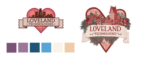 |
| Loveland Technologies' color palette and logos before the rebrand. |
We interviewed a few different creative firms of different sizes and specialties, and decided on Agnes Studio out of Cleveland, Ohio.
From the start of our conversation with Agnes, we had an easy rapport. We like thinking about things from first principles rather than following templates, so we weren’t bothered when they told us they hadn’t worked with a “tech and data” company before.
Having the chance to explain ourselves to a thoughtful team of designers and communicators from outside our industry was refreshing and energizing. We want to be the household name that people turn to first when they need land, property, and infrastructure information, and Agnes helped us think through that from first principles.
We shared our history, values, and ambitions – including some of the future products and services we plan to release over time – and in short order we were looking at a few different treatments that quickly converged into a final form.
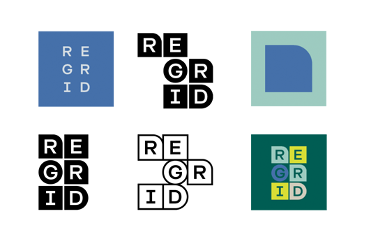
Tucked into the name Regrid is the notion of a fresh look and a changing landscape. Agnes presented us with a dynamic set of symbols and colors, starting with the logo – which can be formatted in multiple layouts – and continuing into our colors, content, and style guides. It’s a foundation upon which we can do theme and variation, changing while being recognizable.
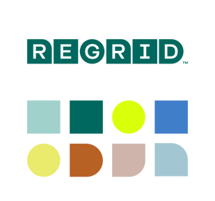
Working from the logo, symbols, and color palette, we set out to find an illustrator who would “get us” and whose work lends itself to the theme and variation we envisioned. We came across Meg’s work when a friend tweeted their appreciation of it, and we agreed. Rarely do you find an illustrator who does maps and data visualization with charm and thoughtfulness. From the first conversation with Meg it was clear there wasn’t a lot of explaining to do.
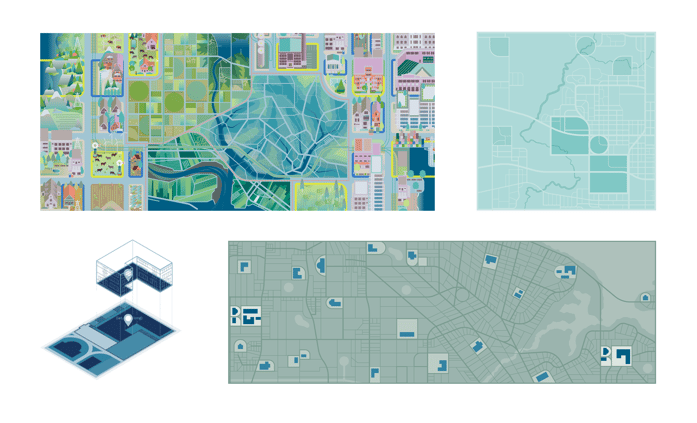
Meg’s illustrations will continue changing over time, plugging into the design foundations we worked out with Agnes, and channeling through the creative ideas of our own in-house design and marketing team.
We appreciate their work and partnership very much, and want to thank them and point to them.
You can follow Agnes Studio on their Website, Instagram, and Facebook.
You can follow Siteations on their Website, Instagram, and Twitter.
